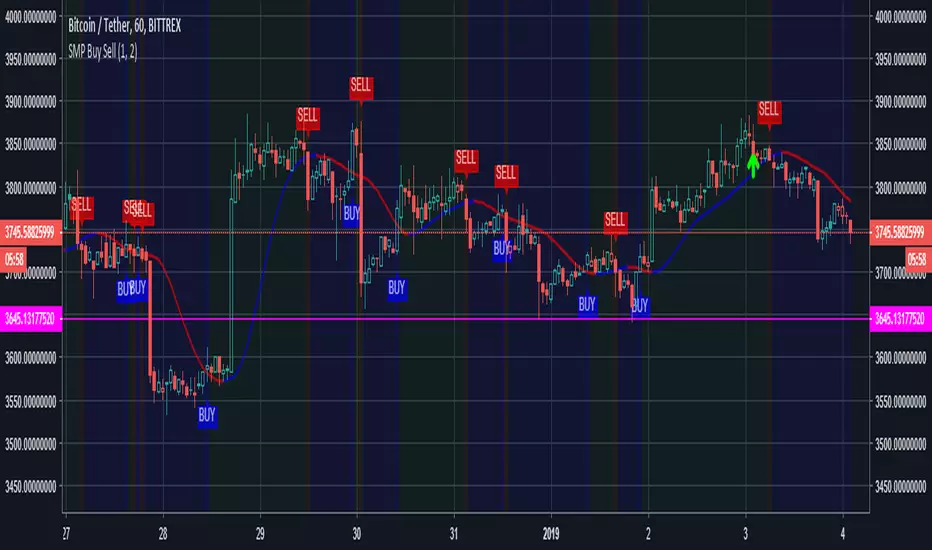
[ProfitTrailer] DEMA Cross Buy/Sell StudyProfitTrailer buy/sell study for DEMACROSS strategy.
The script highlights the region where trailing is most likely to succeed.
Pesquisar nos scripts por "Buy sell"

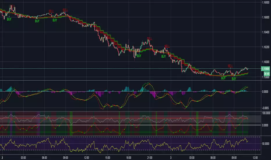
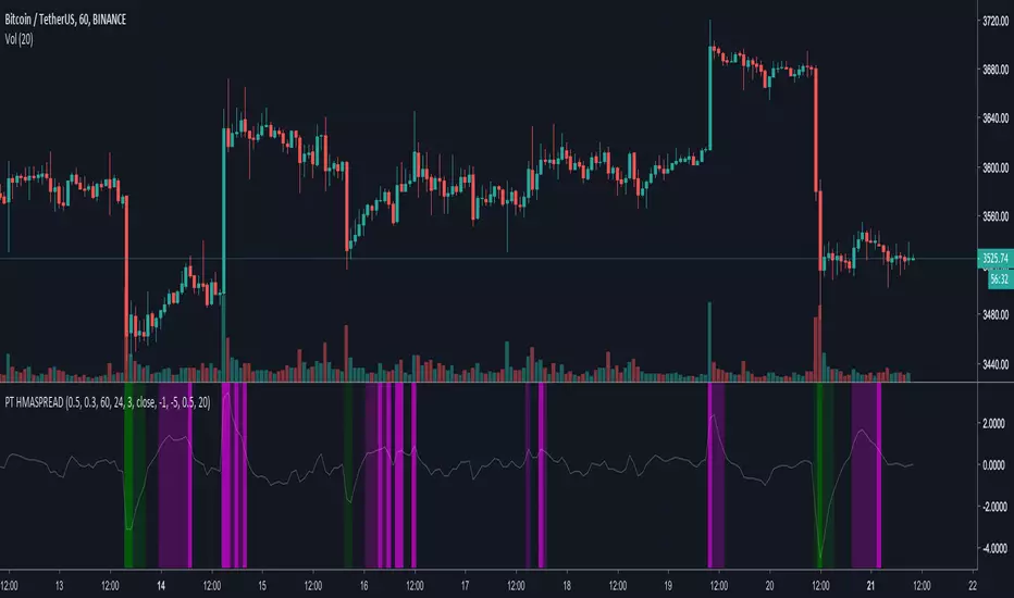
[ProfitTrailer] HMASPREAD Buy/Sell studyProfitTrailer buy/sell study for HMASPREAD strategy.
The script highlights the region where trailing is most likely to succeed.
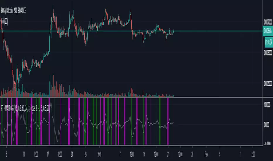
[ProfitTrailer] HMACROSS Buy/Sell StudyProfitTrailer buy/sell study for HMACROSS strategy.
The script highlights the region where trailing is most likely to succeed.
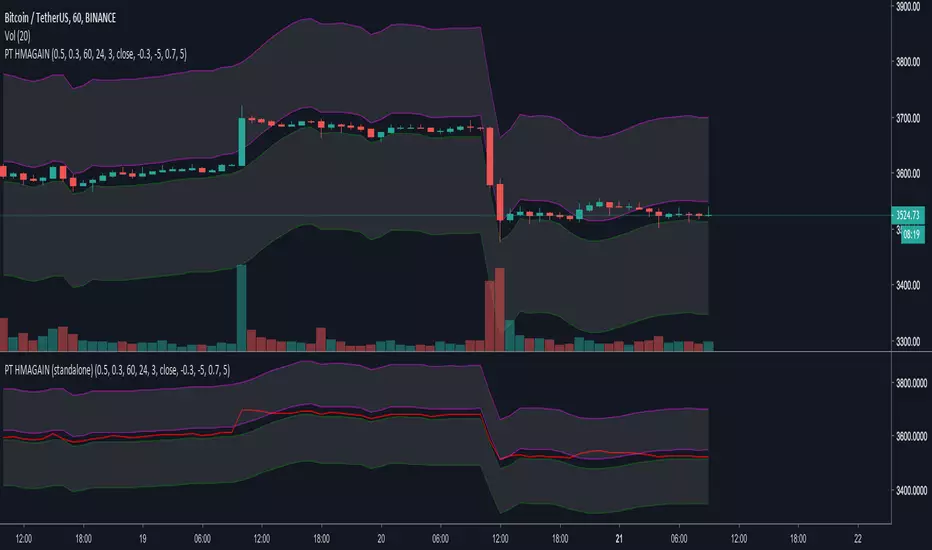
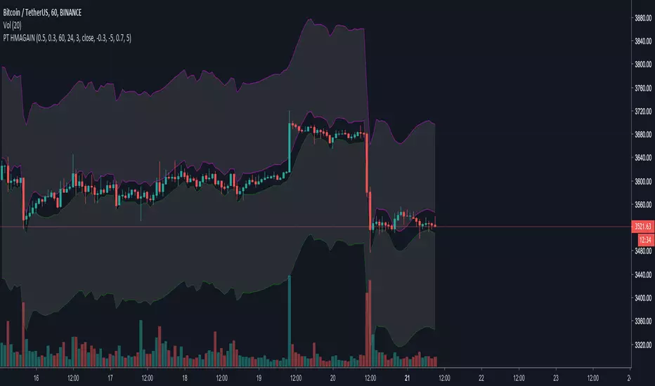
[ProfitTrailer] HMAGAIN Buy/Sell Study (standalone)ProfitTrailer buy/sell study for HMAGAIN strategy (standalone indicator).
The script highlights the region where trailing is most likely to succeed.
[ProfitTrailer] HMAGAIN Buy/Sell StudyProfitTrailer buy/sell study for HMAGAIN strategy.
The script highlights the region where trailing is most likely to succeed.
[ProfitTrailer] OBV Buy/Sell studyProfitTrailer buy/sell study for OBV strategy.
The script highlights the region where trailing is most likely to succeed.

[ProfitTrailer] SMA Spread Buy/Sell studyProfitTrailer buy/sell study for SMASPREAD strategy.
The script highlights the region where trailing is most likely to succeed.

[ProfitTrailer] EMA Spread Buy/Sell studyProfitTrailer buy/sell study for EMASPREAD strategy.
The script highlights the region where trailing is most likely to succeed.

Renko scalp (buy/sell) indicatorThis script is based on some variations of Rocket (from Until1Mil group) scalping strategies.
It uses Renko to determine buy/sell areas.
More details can be found on my steemit page (same user as here).

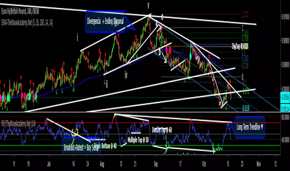
RSI with Visual Buy/Sell Setup | Corrective/Impulsive IndicatorRSI with Visual Buy/Sell Setup | 40-60 Support/Resistance | Corrective/Impulsive Indicator v2.15
|| RSI - The Complete Guide PDF ||
Modified Zones with Colors for easy recognition of Price Action.
Resistance @ downtrend = 60
Support @ uptrend = 40
Over 70 = Strong Bullish Impulse
Under 30 = Strong Bearish Impulse
Uptrend : 40-80
Downtrend: 60-20
--------------------
Higher Highs in price, Lower Highs in RSI = Bearish Divergence
Lower Lows in price, Higher Lows in RSI = Bullish Divergence
--------------------
Trendlines from Higher/Lower Peaks, breakout + retest for buy/sell setups.
###################
There are multiple ways for using RSI, not only divergences, but it confirms the trend, possible bounce for continuation and signals for possible trend reversal.
There's more advanced use of RSI inside the book RSI: The Complete Guide
Go with the force, and follow the trend.
"The Force is more your friend than the trend"
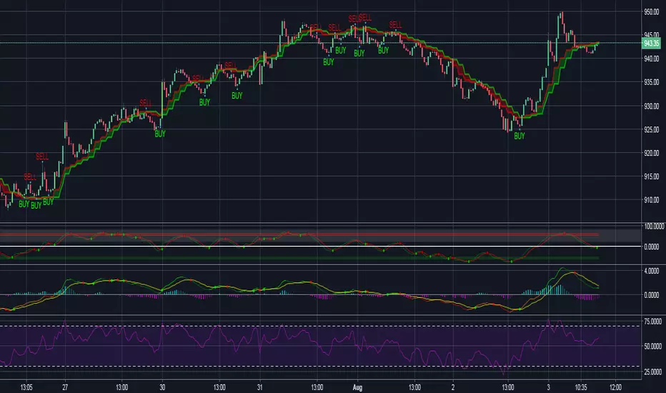
[PT] SMA Cross Buy/Sell studyProfitTrailer study for SMA Cross buy/sell strategies.
The script highlights the regions where trailing is most likely to succeed.

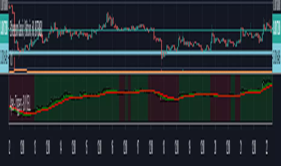
Apex - Triggers - BUY/SELLThis script builds up a chart of a Pair that you are setting triggers for.
Currently supported following pairs:
- BTCUSDT
- ETHUSDT
- ETHBTC
- BNBBTC
- BNBETH
- BUY will be marked green and SELL will be marked red everything else will be default
- It is build up of the same scripts used for for Other APEX Scripts for more detailed overview please have a look here:
VJ_Holy_Grail_ScalperA simple scalping indicator
Green triangle = Buy
Red triangle = Sell
Added buy/sell alerts for Autoview

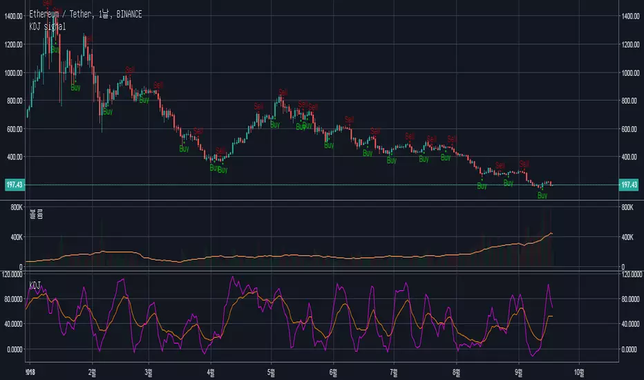
KDJ buy sell simple overlay index ⓙ★ Simple buy/sell signal using KDJ index. (overlay version)
Buy when J line is going up and and over-crossing KD line.
Sell when KD line is going up and and over-crossing J line.
custom High/Low lines (default setting is 70 for high, 30 for low)
Buy☆ signal indicates when RSI is lower than low line and KDJ is on 'Buy' signal
★ Korean
J 선이 KD 선보다 높을 때, buy 신호를 줍니다.
KD 선이 J 선보다 높을 때, sell 신호를 줍니다.
선표시 (조절가능, 기본은 높은선 70, 낮은선 30)
Buy☆는 RSI가 low line보다 낮고, KDJ가 'Buy' 신호일 때 표시됩니다/

VJ_Holy_Grail_Scalper_Swing_Trader_v1// Added Scalper and Swing Trader in 1 indicator to help those who are using free version on TV
// Added Alerts for Scalp Buy/Sell, Swing Buy/Sell and TP alerts(for both scalper and swing trader) to work with Autoview

KDJ buy sell simple index ⓙSimple buy/sell signal using KDJ index.
Buy when J line is going up and and over-crossing KD line.
Sell when KD line is going up and and over-crossing J line.
J 선이 KD 선보다 높을 때, buy 신호를 줍니다.
KD 선이 J 선보다 높을 때, sell 신호를 줍니다.

BuySell(Basel major swing ver 1.0)
--------------------------------------------------------------------------------------------------------------------------------------------------------------------------------
We have developed an algorithm that generates the buy and sell signals in 50/50 ratio where it's most reliable and accurate.
The signals are implemented to not overlap with one another. (no repaints)
By entering the initial seed capital, it will allow to measure the profitability in the future and the validity of the buy and sell signals.
Depending on the changing trading volumes, the system divides the chart into sections to decide for us whether it's safe to buy/sell or not.
Yellow = rising tide
Light yellow = ready to rise
Dark gray = falling tide
Light gray = crash
The buy signals occur only in the yellow colored section, which has the most trading volume.
--------------------------------------------------------------------------------------------------------------------------------------------------------------------------------
매수와 매도에서 신뢰도 있는 타점에서 매매신호가 1:1 비율로 발생하도록 알고리즘을 구현했습니다.
매매신호는 리페인팅이 없도록 구현하였습니다.
때문에 초기시드를 입력하면 이후에 시드변화가 어떻게 변하는지 측정하고 매매시그널에 대한 신뢰도를 검증 할 수 있습니다.
거래량에 따라서 차트에 구간을 나눠줘서 매매가 가능한 구간을 나눠줬습니다.
진노랑 = 상승구간
연노랑 = 상승준비
진회색 = 눌림구간
연회색 = 하락구간
매수신호는 거래량이 많이 들어 온 구간인 진노랑 구간에서만 발생합니다.
--------------------------------------------------------------------------------------------------------------------------------------------------------------------------------
BuySell대로 매매 했을 시에 시드변화와 존버시의 시드 변화 그래프 (파란색이 바셀, 빨간색이 존버)
BlueLine is Basel trading blance, RedLine is buy and holding blance.
--------------------------------------------------------------------------------------------------------------------------------------------------------------------------------

Stock Vn Signal Buy Sell Pro [PlungerMen]Vn Stock Signal Buy Sell Pro , mix 2 indicaror in it for exactly Signal
This Script is perfectly functional and works well by me and the best way to use this script is to use it with “Long Short" script, both compliment for each other. the "Long Short" script is Free, you can find it by searching
If you want to be more accurate and more efficient, more comfortable when you do not want to see too many other indicators, you can register for our Professional edition.
- The Professional Edition supports Level 1 and Level 2 commands ( display at chart : LONG+, long-, SHORT,+,short- ), which are very effective in allocating funds and optimizing your profits
Besides that,You will be supported by personal preferences, profit maximization -2.64% -1.30% -3.21% -3.33% -3.27% Scalping Pro and B Long Short Pro
- We will invite you to the signal channel Telgram with the announcement of the bottom and the peak of the BTC -3.11% -2.64% -1.30% -3.21% -3.33% -3.27% 0.60% -0.13% ,the big variable variable has exists
**We hope you enjoy this script. Your support will help us develop more good quality scripts in the future to serve the community **
**Remember, Like this script and posivite feedback if you are satisfied**
if you have any questions, post a comment ... below here
*********** Guide:
+ option for all frames : Click setting and input high and low for time inteval
+ hide wave trend : Click setting -> click Style --> Up trend Fill or Down trend fill
******
New features: this time we add two lines that can help traders trader safer. When the red line cross above the green line means we are in the downtrend and when the green line cross above the red line, which means we are in a uptrend. This new features will help traders do a safer trade at small time frame.
We have the Script free for the user pass, search keyword " Vn Stock Signal Buy Sell Pro "
-->> 0.2 eth/1 month will be used Script: Vn Stock Signal Buy Sell Pro Pro an Super Bot alert telegram <--
Forex Signal buy sell Pro [PlungerMen]Forex Signal buy sell Pro , mix 2 indicaror in it for exactly Signal
This Script is perfectly functional and works well by me and the best way to use this script is to use it with “Long Short" script, both compliment for each other. the "Long Short" script is Free, you can find it by searching
If you want to be more accurate and more efficient, more comfortable when you do not want to see too many other indicators, you can register for our Professional edition.
- The Professional Edition supports Level 1 and Level 2 commands ( display at chart : LONG+, long-, SHORT,+,short- ), which are very effective in allocating funds and optimizing your profits
Besides that,You will be supported by personal preferences, profit maximization -2.64% -1.30% -3.21% -3.33% -3.27% Scalping Pro and B Long Short Pro
- We will invite you to the signal channel Telgram with the announcement of the bottom and the peak of the BTC -2.64% -1.30% -3.21% -3.33% -3.27% 0.60% -0.13% ,the big variable variable has exists
**We hope you enjoy this script. Your support will help us develop more good quality scripts in the future to serve the community **
**Remember, Like this script and posivite feedback if you are satisfied**
if you have any questions, post a comment ... below here
*********** Guide:
+ option for all frames : Click setting and input high and low for time inteval
+ hide wave trend : Click setting -> click Style --> Up trend Fill or Down trend fill
******
New features: this time we add two lines that can help traders trader safer. When the red line cross above the green line means we are in the downtrend and when the green line cross above the red line, which means we are in a uptrend. This new features will help traders do a safer trade at small time frame.
We have the Script free for the user pass, search keyword " Bitmex Scalping PlungerMen"
-->> 0.2 eth/1 month will be used Script: BForex Signal buy sell Pro an Super Bot alert telegram <--